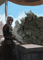
Tuesday, 2 February 2016

Ah man

Well I need a new graphics card so....lets do the polycount/ allegorithmic contest.
Do I think I can win? nope
Do I think I can finish in time? nope.
Chances seem like usual. 

Story goes along the lines of.
-War
-Renowned Hero/king. Feared warrior. The beast of (insert fantasy name)
-Peace
- no longer needed/ no longer wanted.
- madness
- death

-...and that;s all I got to. trying to tie in the beauty part. something about war yada yada. and his soul lingers in his sword

Blocking out. Everything is muddeh


maya blockout to find proportion and gesture. zbrush details


Tuesday, 26 January 2016

Eh its 2016.

Havent updated in a while.

Here's some stuff im working on.

I call her Armour Fist gal by Krenz Cushart
concept:
https://www.artstation.com/artwork/ndGeX

She's 10% textured and hair is very wip (needs more clumps, geo and they are all sharing one textured plane)  However, my 5 year old laptop is showing its age and I'm starting to blue screen while texturing lolol. So I will have to put this on hold until I can afford a new computer :<.  Which may be a while. Also here's a wip of her Armour fists, still tinkering with the design, i.e how do thumbs work.


And Fury Beats - Sophie by Sergi Brosa
concept:
https://www.artstation.com/artwork/mAlGv

Wip, baggy stuff is hard D:

Hopefully this year I can work more on my fundamentals. I feel like in 2015 I learnt a bit but forgot a lot. I'm really not where I wanted to be art wise. 

Thursday, 1 October 2015

bloop study, totally butchered the likeness but was more focused with this colour thing.

What I learnt from this, be very subtle with your values on skin


eh


Wednesday, 30 September 2015

decided to put a pause on the painting. I don't feel like i'm learning anything from it and having a hard time making any progress with it because of my lack of knowledge. I need to go back to basics and also I need to reread that androidarts tut.

These are just some of my notes I have no idea if they are right. Probably wont be able to read it anyway looking at the resolution


But what Ive learnt is that if you want to change colour you should consider desaturating it a bit otherwise the two colours will be too strong against each other making it very jarring, Also adding RGB together gives  white so in real life so I think that desaturating it a bit helps with integrating  the colours.

And colour perception, something about opposite colours, still trying to figure it out. haha super obscure..

Still trying to figure out how to use the hue slider so that i dont have to use the rgb ones.

edit: Something i've always had trouble with was trying to paint something that is normally associated with a colour (an apple is red, etc) and fitting it into a scene that had different colours.

Today I was standing on my driveway thinking about this, and it kind of makes sense to use a limited palette. You are hardly ever going to get a situation where the source of light is all types of different colours.

For example the sky gives a blue tint to everything on a sunny midday. So a green tree would not be flat out green because the blue and green are adding together. And if we remember, when colours add they become less saturated.
Therefore it depends on the strength of the tint. In the Lords of the rings example the blue tint is very strong which is why gandalfs skin isnt even in the pink hue range. In fact it is all in the blue range, so how would I make it pink. If I wanted to create a pink hue in a blue tinted scene I would have the blue desaturated leaning towards the red. What not to do is pick pink and go down the hue slider because you are picking a colour that would not occur in a heavily blue tinted scene.

And thats why I keep hearing that in digital you have too many colours to choose from, the freedom helps make wrong choices. Sorry if none of this makes sense or isnt even right :P.


Wednesday, 23 September 2015

Trying to paint regularly at least for 30mins to and hour.


Also finished hanzo quite a while ago, just need to make presentation shots,

Friday, 17 July 2015

little update.

Blocking in my textures. And a little work on the zombie

Edit: Derp orange skin and lighting


Saturday, 11 July 2015

 wooooooshh! havent updated this blog in a while. But still quietly working on my art. I've been learning a lot these past few months. Which means I become even more stupid lol....

This is a zombie based on the concept by Max Davenport. https://maxdavenport.files.wordpress.com/2012/06/grundar.jpg
https://maxdavenport.wordpress.com/
Dude's a beast.

I did this to learn the pipeline with all the different maps (also the topology is rushed). Textures still need work, Like alot of work. First time ever normal mapping something, So much fun to spin a low poly with a normal map applied!


I gave up trying to concept an Overwatch character. My design skill are still too weak :<. Need to work on done for sure!. Then after that I tried to make a character for a while but had to scrap it because it was no where near what I wanted. I rushed it too early and so my foundation was wobbly. 

So I decided to try again and make a Hanzo from overwatch. Currently at the packing uvs stage, test bakes all done. And then on to texturing!


And a few things I want to work on after I complete Hanzo. These aren't priority so Ive been slowly chipping on these during night/breaks. 

Darksiders 2 concept by Dawid Frederik
It's a mash up of two concepts but I might change concept. *shrug*


Overall I wish I could get faster but I guess that will take some time. Oh yeah and if interested heres my tumblr, usually pot non wip things there http://hidaew.tumblr.com/